PAUW Dashboard
Het PAUW dashboard biedt informatie naar aanleiding van de publicaties van de circulaires. Het dashboard geeft in een aantal stappen meer inzicht in de uitkering gemeentefonds voor Nederland en op gemeenteniveau.
Eenvoudig inzicht in uitkering gemeentefonds
Gemeenten ontvangen geld van de rijksoverheid uit het Gemeentefonds. Dit budget wil je inzichtelijk hebben voor jouw gemeente. Speciaal voor de specialist Gemeentefonds, het management, college en gemeenteraad hebben we het dashboard PAUW ontwikkeld, waarin we de data van de rekenmodellen van het Ministerie van Binnenlandse Zaken en Koninkrijksrelaties in Power BI visualiseren en begrijpelijk maken.
Gebaseerd op circulaires van uitkeringsjaar 2024
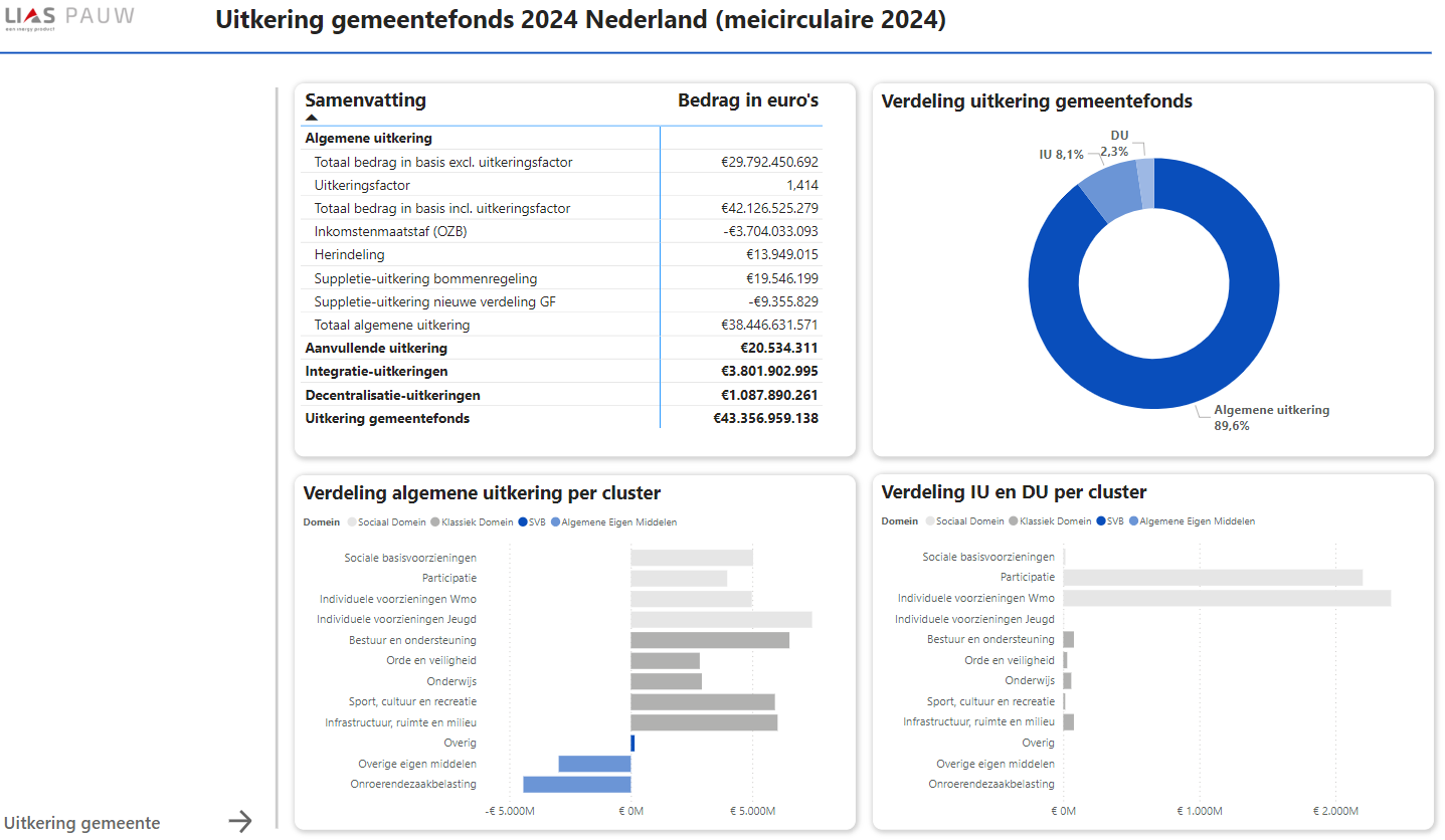
Het dashboard biedt informatie naar aanleiding van de publicatie van de circulaires van uitkeringsjaar 2024. Het dashboard biedt je informatie in de algemene uitkering, de decentralisatie- en integratie-uitkeringen en aanvullende uitkeringen voor Nederland en vervolgens op gemeenteniveau. Ook kun je voor een gemeente bekijken wat het aandeel is in het Gemeentefonds, wat het bedrag is per uitkeringspunt en het bedrag in basis per inwoner.
Inzicht in de uitkering van het gemeentefonds
Het dashboard geeft in een aantal stappen meer inzicht in de uitkering gemeentefonds van een gemeente. In een logische route kan je doorklikken van: het landelijk beeld van de algemene uitkering, de decentralisatie- en integratie uitkeringen en aanvullende uitkeringen of naar een gemeente. Op het niveau van een gemeente geeft het dasboard PAUW inzicht in: het aandeel gemeentefonds en het bedrag in basis per inwoner.
Vervolgens wordt de algemene uitkering vergeleken met het landelijk gemiddelde per inwoner op het niveau van de domeinen, de clusters en de maatstaven. Het dashboard PAUW is een betaalde dienst naast LIAS PAUW. Het abonnement is jaarlijks opzegbaar.
Vraag het PAUW dashboard aan
Je vraagt het PAUW dashboard eenvoudig aan. Na het invullen van het formulier nemen we contact met je op over de oplevering van het dashboard. Heb je nog vragen? Neem dan gerust contact op met Sonja Valstar via sonja.valstar@inergy.nl of Martijn Renders via martijn.renders@inergy.nl.
Veelgestelde vragen
Wat is het voordeel van het PAUW dashboard?
Het dashboard geeft in een aantal stappen meer inzicht in de uitkering gemeentefonds voor Nederland en een gemeente. De cijfers gaan we actualiseren bij elke mei- en septembercirculaire met de data van de rekenmodellen van het ministerie van BZK. Zo blijven we het dashboard jaarlijks bijwerken met de uitkering gemeentefonds van het lopende uitkeringsjaar. De circulaires blijven we uiteraard verwerken in de LIAS PAUW applicatie, waarin je je gemeentefondsuitkering kunt analyseren en ook zelf een prognose kunt maken voor de komende jaren.
Kan ik de uitkering gemeentefonds alleen voor mijn eigen gemeente bekijken?
Nee, dat is voor alle gemeenten mogelijk zodat je ze met elkaar kunt vergelijken.
Wordt het dashboard doorontwikkeld?
Ja, wij zorgen voor het uitbreiden en actualiseren van het dashboard op basis van jullie informatiebehoeften en nieuwe toepassingen ontwikkelen. Hierbij willen wij ons richten op de informatiebehoefte vanuit het gemeentefonds.
Heb ik Power BI nodig om gebruik te maken van PAUW dashboard?
Ja, na het indienen van een aanvraag via het contactformulier ontvang je een handleiding met een beschrijving hoe je een gratis versie van Power BI kan downloaden.
Welke gegevens moet ik zelf invoeren?
Om meer inzicht te krijgen in de uitkering gemeentefonds van een gemeente hoef je zelf niets in te voeren. In het dashboard PAUW is alle data gebundeld. Zo heb je direct inzicht in de uitkering gemeentefonds voor Nederland en een gemeente zonder zelf tijd kwijt te zijn aan het invoeren van gegevens.
Is er een helpdesk beschikbaar?
Ja, voor technische vragen over de applicatie en inhoudelijke vragen over het vakgebied financiële verhouding kan je altijd terecht bij de helpdesk van LIAS PAUW. Deze is te bereiken via het mailadres info-liaspauw@inergy.nl.
Ook kan je bellen met Sonja Valstar, 06-82896643 of Martijn Renders, 06-26901289.
Kan ik het abonnement opzeggen?
Het abonnement is jaarlijks opzegbaar. Stuur hiervoor uiterlijk een maand vóór 31 december een mail naar info-liaspauw@inergy.nl
Ik wil nog iets meer weten over het PAUW dashboard
We laten het dashboard graag zien. Je kan bellen met Sonja Valstar 06-82896643 of Martijn Renders 06-269-1289 of een mail sturen naar info-liaspauw@inergy.nl.